Sartorius AG
Transfer of brand experiences into future design principles

Sartorius AG is an international technology leader in the biopharmaceutical and research industries with a focus on pharmaceutical and laboratory suppliers. In 2020, Sartorius AG presented its new brand identity to the world. In the process, the image and appearance of the Sartorius brand were fundamentally revised. A highly reduced logo and the combination of yellow and black created a distinctive and unmistakable brand recognition. Just as the brand identity was already based on the claim "Simplifying Progress," it was also the essential guiding principle for the strategic development of an overarching product language.
Task
The challenge was to develop a product vision that would be incorporated into future product developments in order to transfer the new brand identity to the entire product portfolio. At the same time, the brand experience was to be sustainably strengthened. The design was to be further developed in the tension between evolution and revolution and to show a strong differentiation and independence from the competition. Over the past two years, WILDDESIGN has taken on this task and demonstrated its expertise in brand strategy and product design.
Procedure
Managing a product portfolio with hundreds of products, different hygiene requirements and limitations requires extensive expertise and proven processes. At WILDDESIGN, we draw on many years of experience and proven methods that are essential for this challenge. To begin with, we analyzed the entire product portfolio of Sartorius AG and identified essential commonalities as well as formal characteristics. In addition, we conducted global interviews with stakeholders and users to fully understand both the formal impact and user experience of the products. Through this approach, we gained a comprehensive global overview and were able to identify how and where to integrate the new brand into the product design.
Result
The result was a comprehensive corporate product design based on Sartorius' new identity. The products were designed with regard to their effect from a distance as well as in close-up. All insights and principles gained were recorded in a style guide in close cooperation with Sartorius and were in line with the mission statement "Simplifying Progress". On this basis, we continuously support Corporate Branding & Design in consistently integrating the new brand identity into future product developments.
A clear mission statement as the core of the process
Through a comprehensive analysis phase, we were able to capture the decisive influencing factors for the future operating logic and visual perception and summarize them in a working title. Sartorius' brand promise, "Simplifying Progress," forms the basis for the brand identity. The color yellow plays a particularly important role in this, strengthening the brand's recognizability and enabling improved user guidance with the products. Based on this insight, we defined the working title "Find a new purpose for Yellow," which formed the basis of our strategic approach. The product design, like the logo, was sharpened through simplification and clear subdivision. The Sartorius brand should be recognizable from a distance on the equipment, while the user-friendliness and operating logic of the equipment should be simple and easy to understand. Our goal was to implement a long-distance and close-up effect of the devices that follow the same design principle. We also focused on a simple implementation, so that products acquired in the future, which come with their own design, can also be transferred to the Sartorius product language with a minimum of intrusion. The transition between the old and new design language should be fluid, as well as providing an economical solution that is easy to implement. True to the brand promise of "Simplifying Progress."
The color yellow as a multi-level experience
For the development of the new design principles, selected focus products of the different product areas were defined and served as a basis for decision-making in the development of the new design principles. It was crucial to develop formal and design rules that can be applied across the different product areas and product families.
Long-distance effect
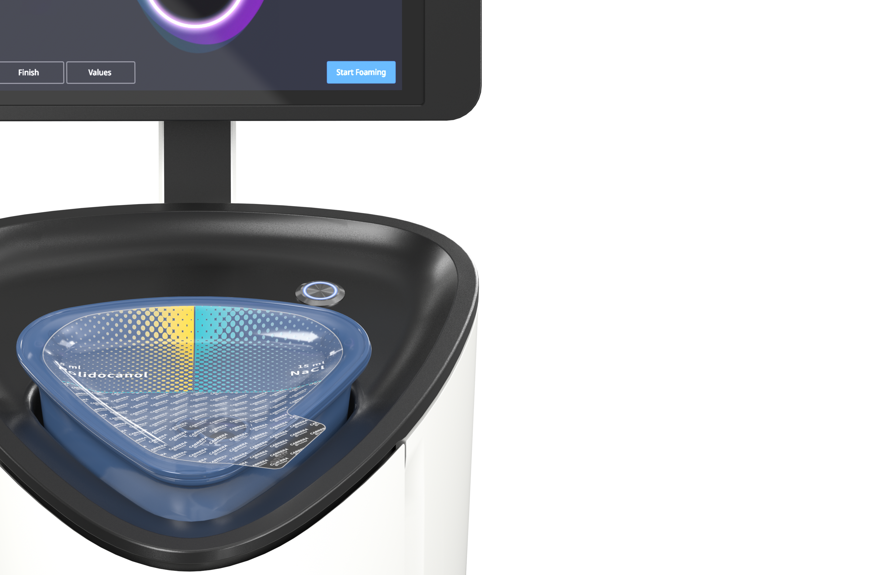
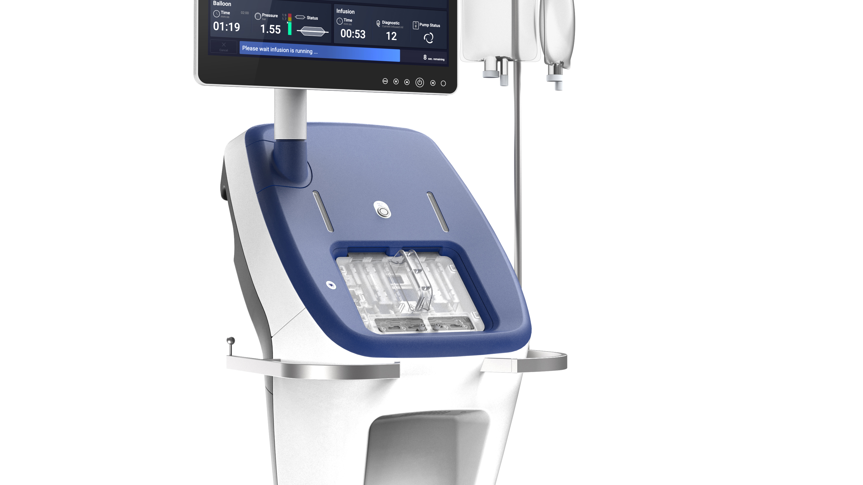
In terms of the long-distance effect and the perceived totality of the product, it was important that the products be clearly recognizable as Sartorius. Our working title "Find a new purpose for Yellow" played an important role here. By implementing a design signature that carries the Sartorius logo and product name in an unmistakable yellow tile, the Sartorius brand is perceived even from a distance. This tile can be resized, but retains its uniformity as a design element. The contrast between the yellow with the black Sartorius logo and the reduced, uncluttered housing design further enhances this effect.
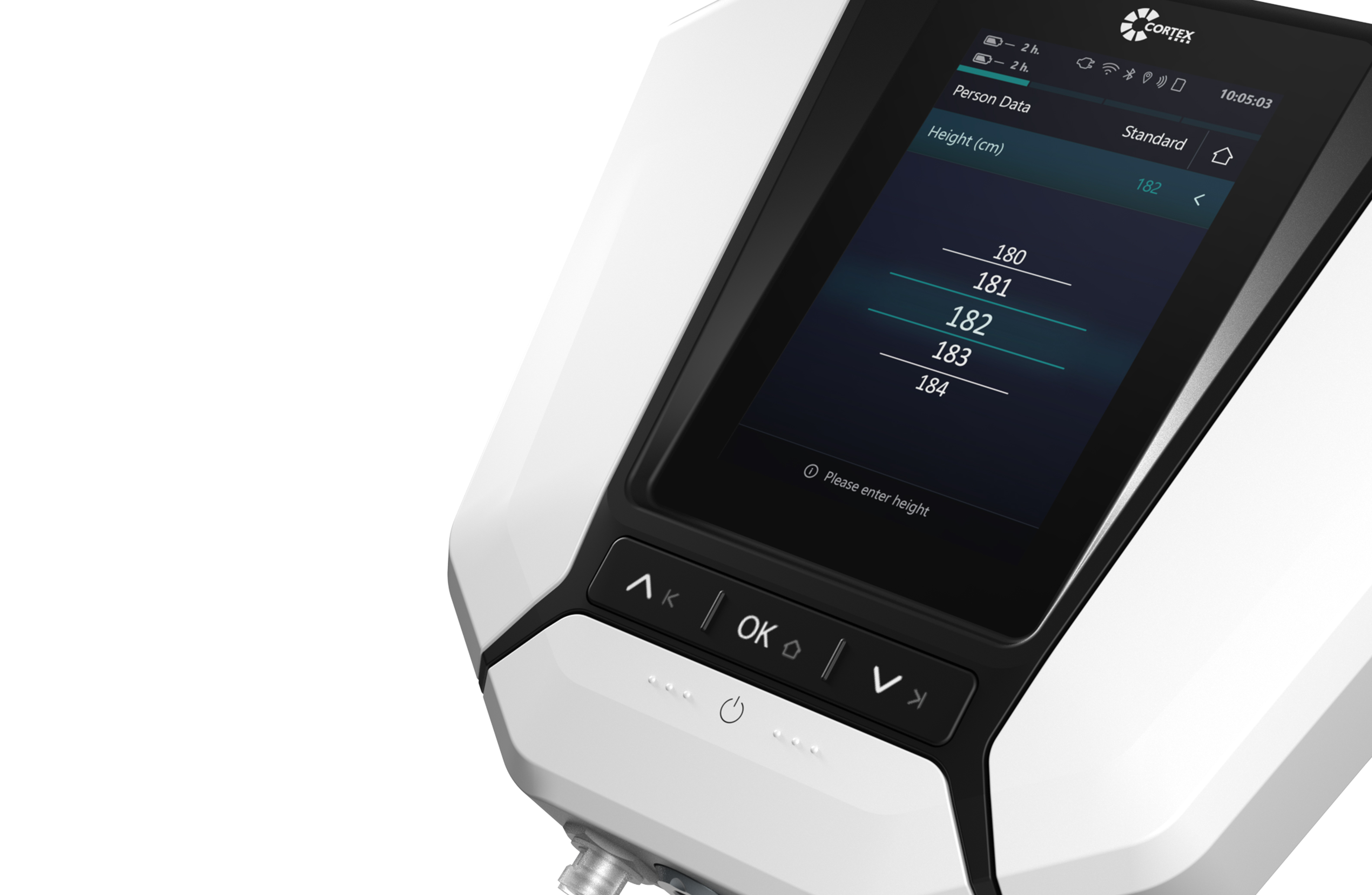
By modernizing and simplifying the design language, the display, which previously served as a distinguishing feature due to its lens shape, was also replaced by the new Sartorius signature. The new rectangular display shape supports the overall modern appearance of the products and facilitates future implementations.
Close-up
For the close-up effect, the rules were strongly influenced by the guiding principle "Simplifying Progress," with a focus on user guidance and operating logic. Interactions and their operation are clearly emphasized through the targeted use of black and yellow as well as clear typography. All interaction areas and components that are to be operated by the user are kept in black and thus stand out from the light-colored housing. Yellow is given an overriding role and prioritizes important functions and operating elements.
The improved visibility of yellow increases safety for users during complex interactions and effectively supports user guidance during essential work steps. These design elements facilitate the intuitive usability of the products and promote an effective workflow.

Wilddesign as strategic partner for corporate branding & design
Close collaboration with Sartorius Corporate Branding & Design enabled us to work efficiently and purposefully towards a successful outcome. Extensive stakeholder surveys enabled us to validate and optimize concepts at an early stage. In addition, the design rules of the concepts were tested on the original products and their effect and function were carefully checked. Another important milestone was the presentation of the results to the Sartorius management. Through this successful collaboration, WILDDESIGN continues to be closely involved in product developments in order to consistently advance the implementation of the design principles. Our goal is to continuously strengthen the Sartorius brand and to optimally adapt the product design to the brand identity.
Sartorius Corporate Branding & Design: David Fehlberg, Frauke Marquardt, Pascal Hirt
WILDDESIGN: Niclas Wagner, Alexander Abele, Frank Ehnes, Bauke Herkt, Thomas Lauterjung
Services & Methods : Design Research, Brand Strategy, Portfolio Design, Design Management
"With WILDDESIGN we found exactly the right partner to work on this strategic project of a consistent product language. The complex product portfolio of Sartorius and the challenging task were quickly grasped by the WILDDESIGN team and the best solution approaches were sought with acumen. A good balance between creativity, vision and pragmatism led to an extremely successful result, which was easy to communicate within the company, especially due to the clear and comprehensible derivation."

Pascal Hirt
Managerof Design and UI / UX
Sartorius

"Inspired by product design, a comprehensive view of the 'big picture' has developed step by step. This is how we define holism."
Your contact person for the project
Niclas Wagner
Head of Office Munich
+49-(0)89-780-196-50
niclas.wagner@wilddesign.deNext gen Medical design
.jpg)